Inventory management and supply chain issues are prevalent globally across businesses of all sizes. Manual inventory tracking via spreadsheets is error-prone, redundant, and time-consuming.
My Roles
UX designer
Project Duration
1 Month
Project Overview
Inventory management and supply chain problems are global and are faced by businesses of all scale and sizes. Using the manual inventory tracking processes across spreadsheets can be redundant, prone to errors, and time-consuming.
Problem
Restaurant managers and chefs need help to efficiently manage inventory and control food costs due to the demanding nature of their roles.
The Goal
Develop an inventory management app that empowers users to handle inventory and reduce food costs efficiently.
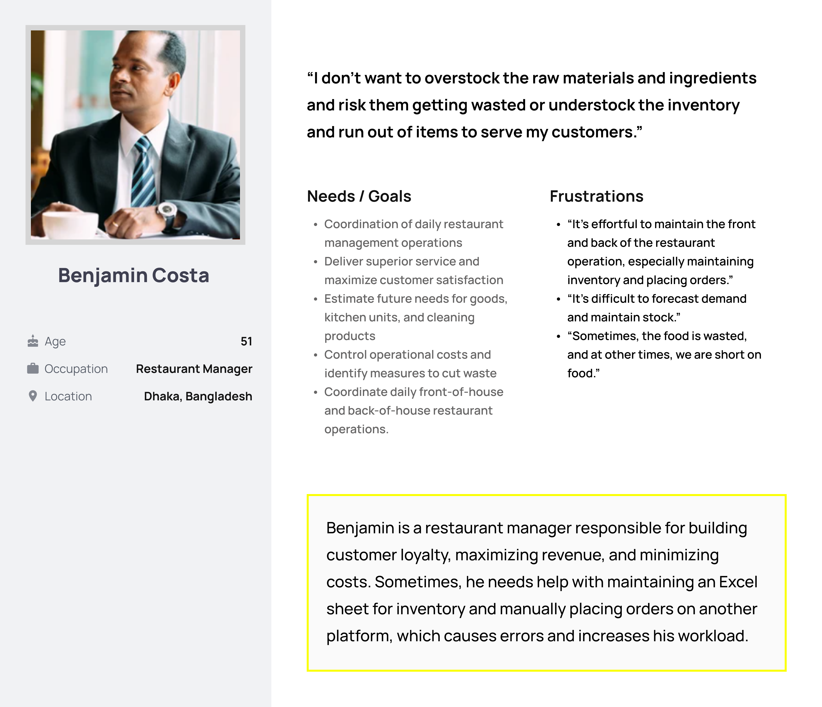
Understanding the user
Conducted interviews and created empathy maps to comprehend user needs. Identified a primary user group managing both front and back-end restaurant operations. Further research revealed that restaurant chefs also play a crucial role in maintaining and updating inventory stocks.
Challenges Faced
Difficulty in Forecasting Demand: Benjamin struggles with accurately predicting customer demand, leading to stockouts or overstocking.
Coordinating with Suppliers: Challenges in effective communication and coordination with suppliers result in supply chain delays.
Maintaining Accurate Stock Levels: Difficulty in tracking and managing stock levels across multiple locations leads to inefficient inventory utilization and potential revenue loss.
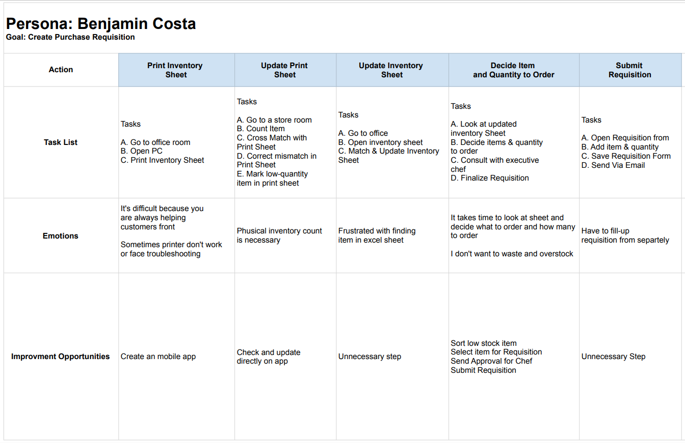
User Journey Map
Mapped Benjamin’s journey, revealing the necessity for users to easily count inventory and place orders.
Benjamin manages inventory and creates purchase requisitions manually using Excel sheets and physical counts.
Faces frustrations with Excel sheets, printer troubleshooting, and the time-consuming nature of the process.
Design Phases
Initiated design phases, starting with paper wireframes, progressing to digital wireframes, and creating a low-fidelity prototype.
Paper Wireframes
I planned the app’s layout, functions, and essential features using rough sketches. The framework was refined through brainstorming and quick paper wireframe iterations before going digital.
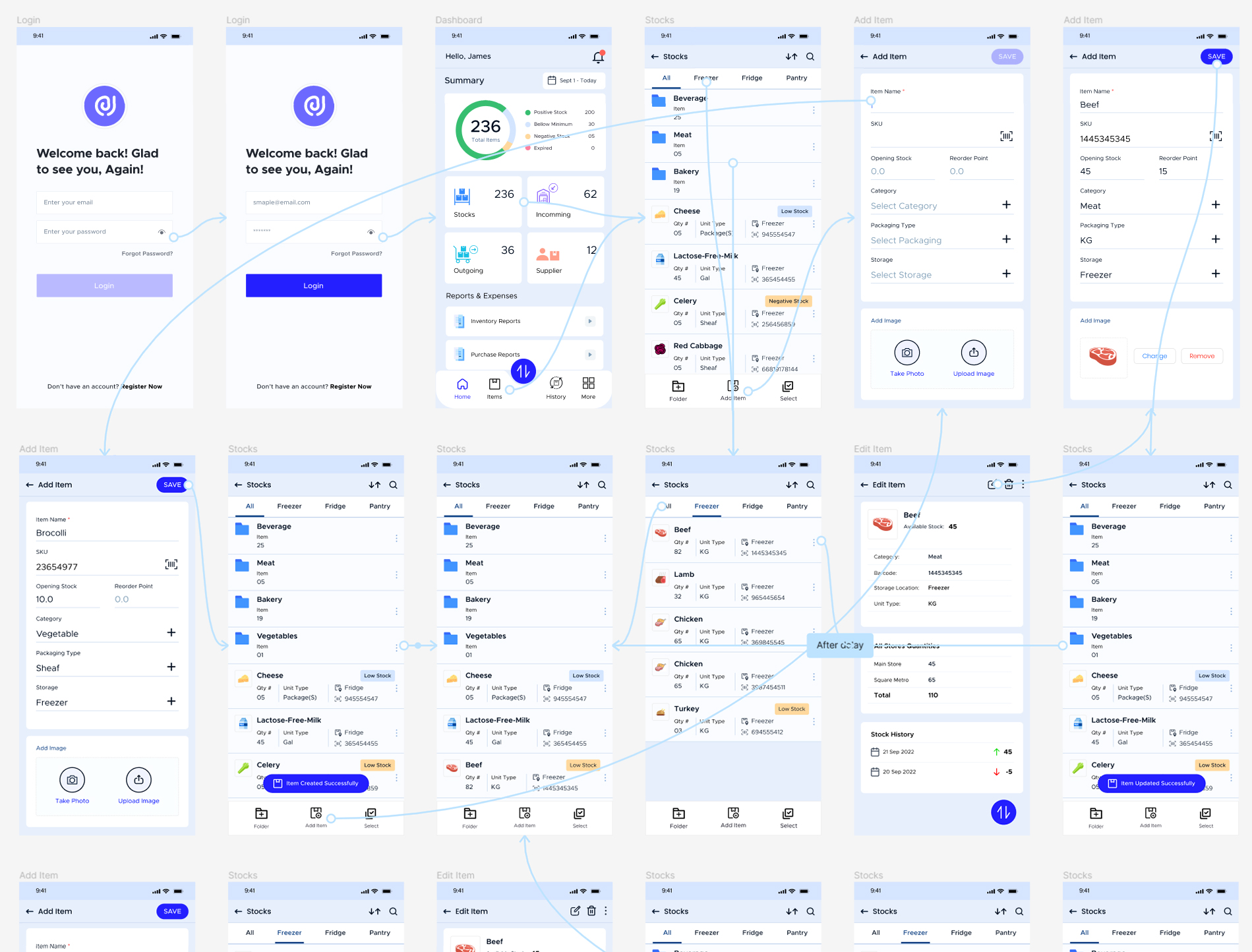
Digital Wireframe
Digital wireframes helped visualize the app’s layout, UI, and interactions. Before prototyping, this phase allowed for more detailed planning, user feedback, and design direction refinement.
Low-fidelity Prototype
The low-fidelity prototype made wireframes interactive, a design breakthrough. Function over form underpins this prototype. Initial testing included user interactions, navigation flows, and feature implementations.
Usability Study
To determine how well the app worked, how easy it was to use, and how friendly it was to the user, usability testing included extensive evaluations. I evaluated the app’s responsiveness to user input and its ease of use via the use of structured tests and in-app interactions.
Study type
Unmoderated usability study
Location
Bangladesh
Participants
5 Participants
Length
20-30 Minutes
Findings
Focused on foundational feedback, identifying user requirements such as item location, packaging details, and overall store quantities. This stage guided wireframes to more refined mockups.
Mockup
Refining the design after usability testing
Protoype
Refining the design after usability testing
Accessibility Considerations
Prioritized accessibility by adding alt text to images for screen readers, using intuitive icons. For navigation and employing detailed imagery for better user understanding.
Provided access to users who are vision impaired through adding alt text to images for screen readers.
Used icons to help make navigation easier.
Used detailed imagery for item and help all users better understand the designs.
Takeaways
Impact
The app makes users feel really thinks about increase efficiency and save money
Received positive feedback from a peer: “The app made it so easy to count stocks and receive notifications about low stocks and soon-to-expire items, helping me avoid overstocks and wastage.”
Learnings
Realized that the initial app ideas were just the beginning. Usability studies and peer feedback significantly influenced each iteration of the app’s designs, emphasizing the iterative nature of the design process.
Next Steps: Conduct another round of usability studies to validate whether the pain points users experienced have been effectively addressed.